News and Insights
A HOMEPAGE REFRESH RENEWS CURB APPEAL
August 20, 2020
Your website’s home page is your organization’s front lawn, garden, porch, facade and entry door, and you might want to make it better, fresher or even more agile for handling different kinds of content. But — there’s always a but — you just redid your site a year or two ago, and you don’t have the time, money or energy to do it all over again.
We feel your pain.
FINN Partners launched our “new” website in 2018 as part of a full brand makeover. We were thrilled at the time with both the rebrand and the website. Now, however — when it comes to the home page — to quote B.B. King, “The thrill is gone.”
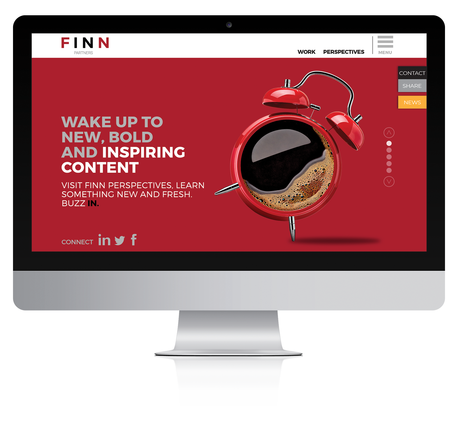
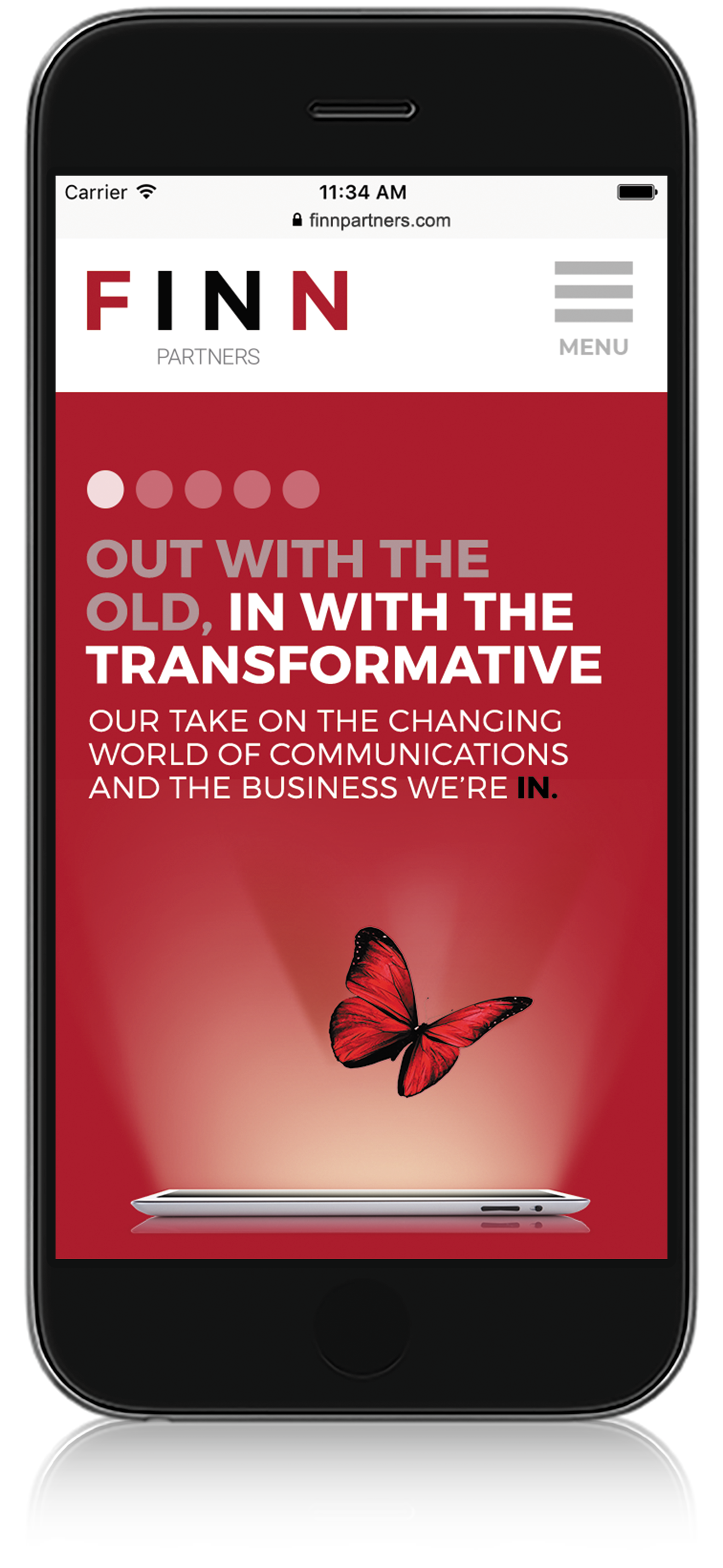
Some within our firm never liked the animated metaphorical objects that featured IN headlines tied to our brand promise; i.e., “Out with the old (ways of marketing), IN with the new.” Others felt it was simply time to change things up a bit. Some felt it was important to show more stuff on the home page.
Yet the need to revamp our digital curb appeal went deeper than our own weariness or well-intentioned opinions. Analytics showed visitors were bouncing from the home page and site because they did not know where to go. Meanwhile, the marketing team needed to promote more of what was new, hot or insightful, with more calls to action. And the continued mobilization of the digital experience suggested scrolling below the fold was not only tolerated, but in fact, visitors now expect to scroll.
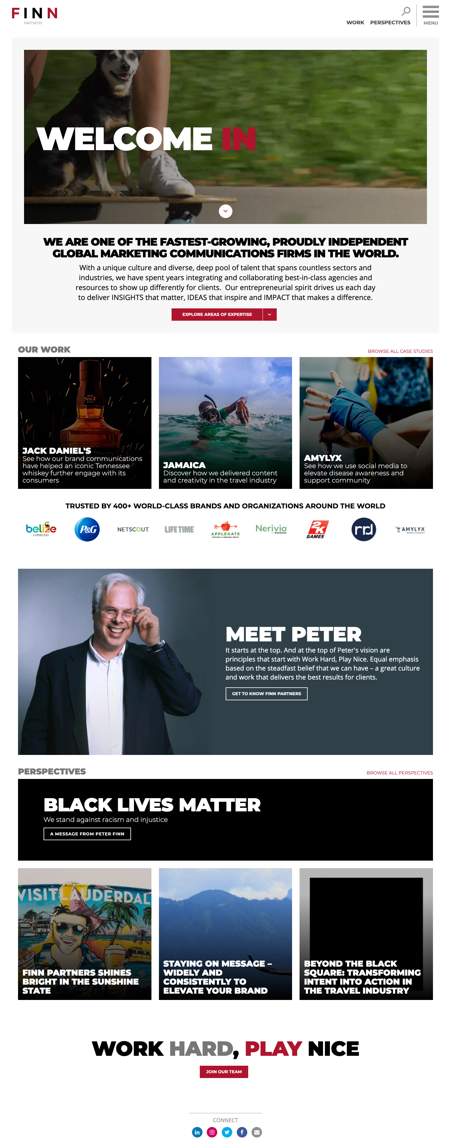
These factors all added up to our own need to say: “Out with the old and IN with the new.” The before and after examples below show the new FINN home page blends seamlessly with all of the untouched internal page designs and content. The right-brained brand creatives have been pacified because the “new” is consistent with the “old” in appearance. Result-driven left-brainers also like the “new” because it accomplishes some very logical and smart marketing goals by:
- Adding video to the home page marquee. Research says that videos, short and well executed, attract eyeballs and clicks.
- Displaying client work and case studies at the front gate. While we have a robust case study library on the FINN site, elevating a few to the home page puts them front and center. You are who you serve, after all.
- Prominently featuring people. We created a FINN Person of Interest module. For now, we share the story of our inspirational founder, Peter Finn; more will follow. This upgrade allows us to humanize our offerings.
- Sharing timely perspectives, like our Black Lives Matter support. This new home page module represents another way to capture the viewer’s interest in our thoughts and actions.
- Adding a module for people looking to join our firm. This takes shape with the four words that define our culture: “Work hard. Play nice.”
Yes, our homepage renovation took some time and consensus to build. In the end, it’s been worth the work and wait.
Your takeaway? You can create more curb appeal (and marketing agility) for your website with a home page renovation — here and now. There’s no need to put it on hold until you are ready to redo the entire website. Please see our work live at www.finnpartners.com, or check it out in screen shots below. And don’t hesitate to call for help with your own renovations.
BEFORE:
AFTER: