News and Insights
Brand refresh or full on rebrand? Good question.
May 1, 2020
Sometimes an identity refresh or upgrade is confused with a rebrand. This is understandable since many of us associate brand with its look and feel or logo. These tools are certainly a part of the equation. However, full rebrands involve repositioning a brand to carve out a new or changed promise of value and position. Refreshes tend to be repackaging of an existing brand position.
In a recent Forbes article, we shared the three reasons why organizations rebrand:
- Your company and/or markets have changed, and the current brand does not reflect who the company is or aims to become.
- There is a merger of enterprises with different names, identities and, at times, markets. In fact, mergers and acquisitions are the most common reason.
- The company’s suit of clothes is out of date, unbecoming or otherwise out of step with the times.
The first two reasons are at the core of rebranding. The third falls into the identity refresh category. To illustrate the latter, we’ve shared a short visual case study below of a great firm in the Pacific Northwest who just completed a refresh.
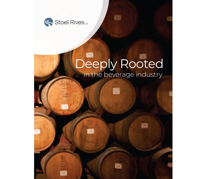
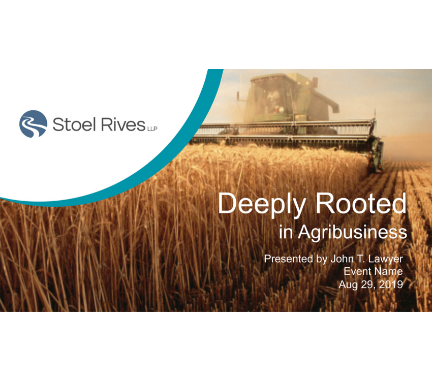
Before:
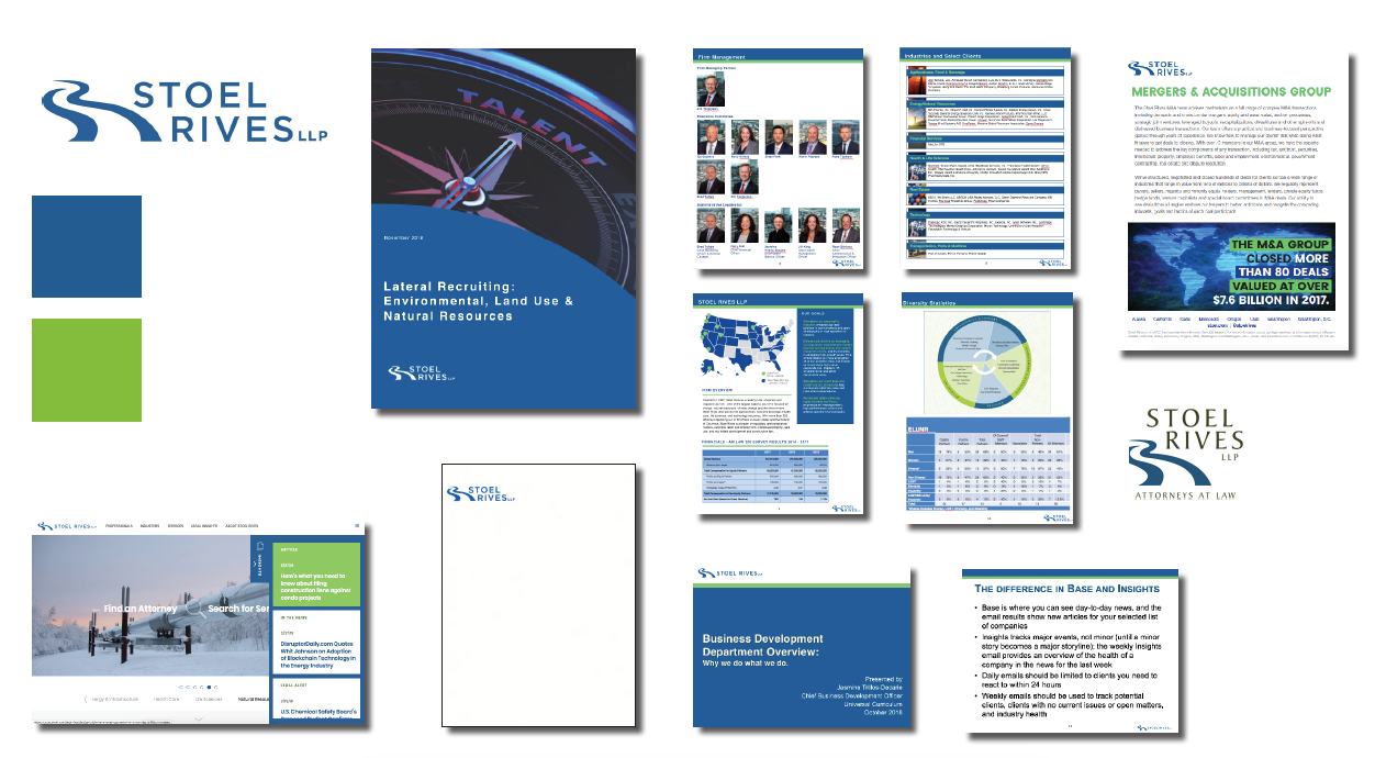
Stoel Rives is a leader among Pacific Northwestern law firms, even as it expands south to places like Utah and “east” to Minneapolis. It serves leading industries throughout the region like natural resources and food & beverage, among others. The regional/industry positioning remains in place. Changed or refreshed are the firm’s logo, core identity system, website displays and everyday pitch and proposal tools. As the before and after shows, this was a classic refresh to match the quality of the practice with the quality of its communications. As one savvy CMO said to us not too long ago, you can’t be perceived as a first-tier provider with second-tier communications.
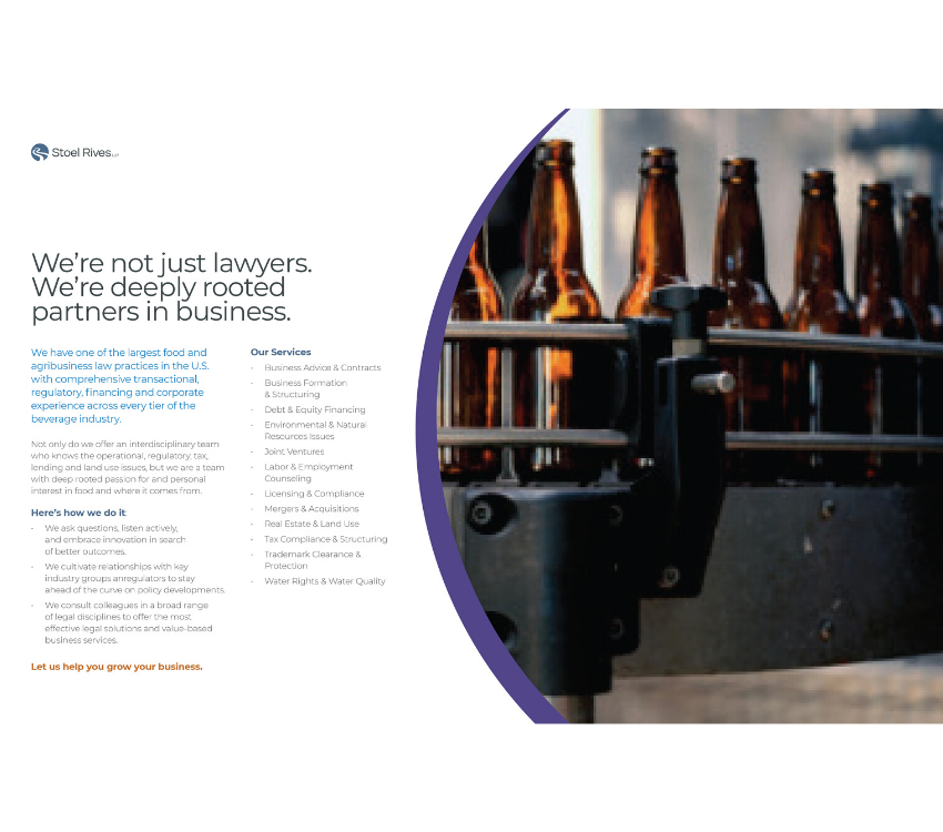
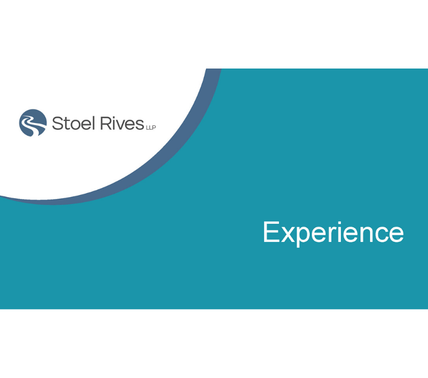
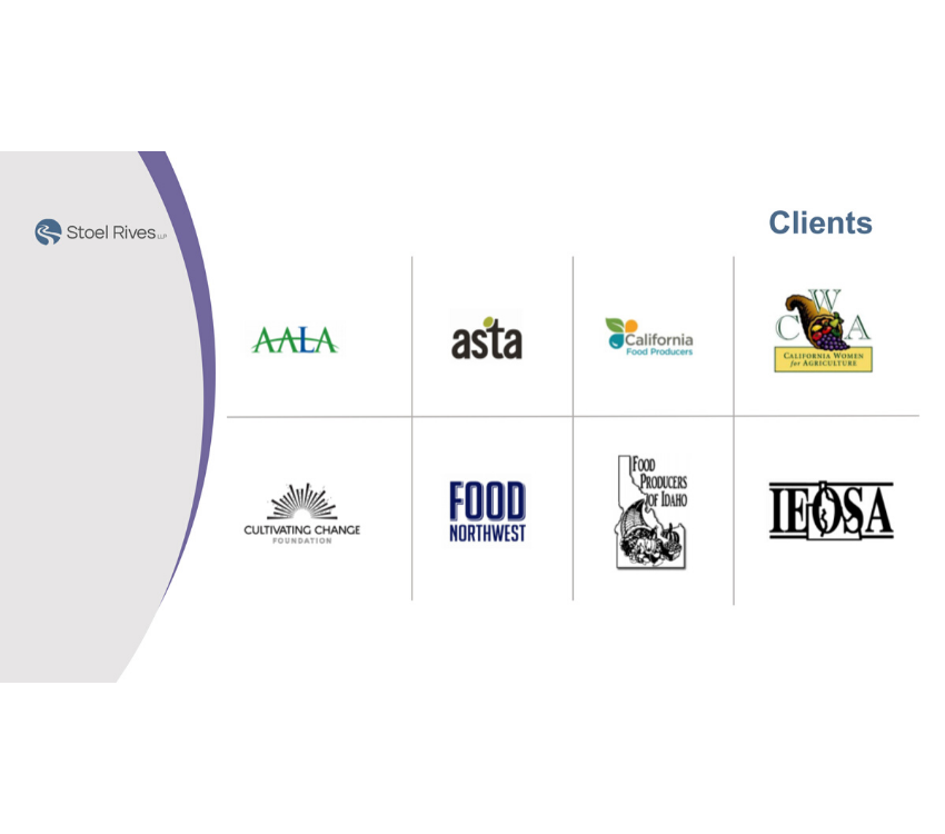
After:
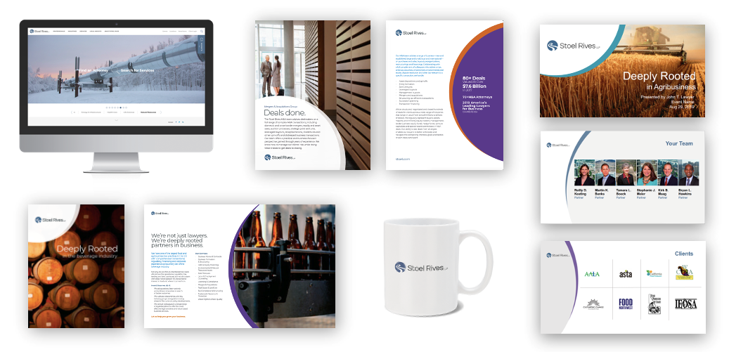
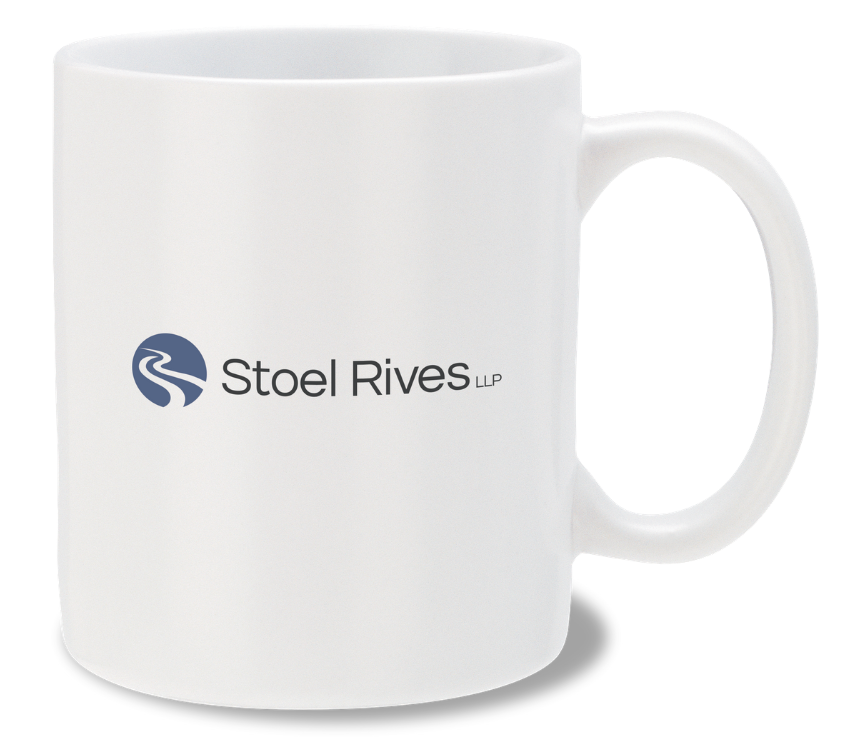
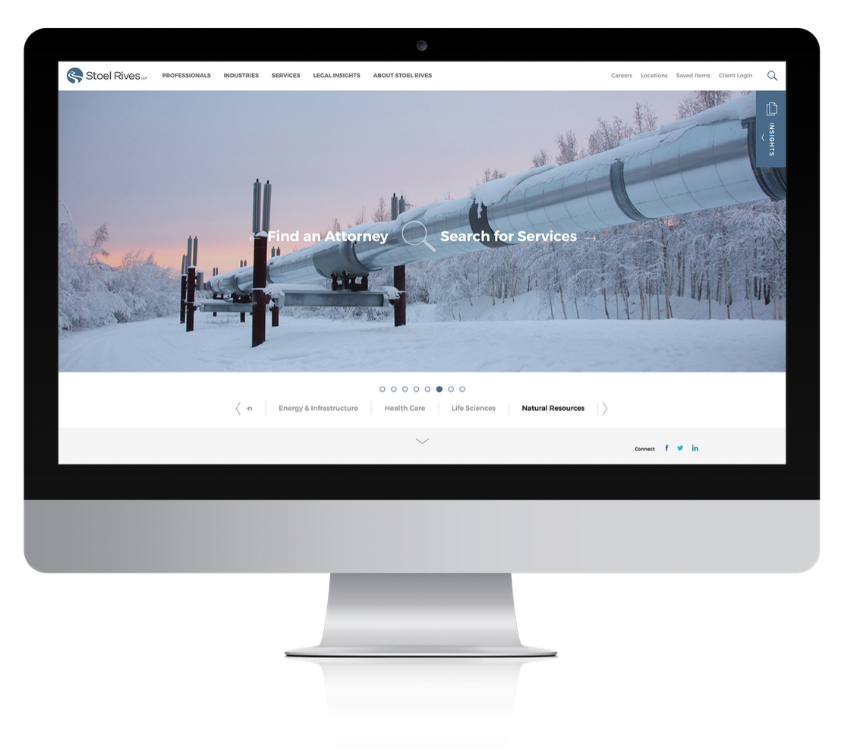
The new modifies the existing SR “rivers” mark and adds a modern typeface. The curves in the mark and the circle that bears it become a design element that anchors all communications—digital, print and those that straddle on and offline delivery. The old monochrome palette of blue and green expands to a broader, brighter approach. The rest is courteous information design. It sounds overly simple, but if you walk into a Stoel Rives office, the first word that comes to mind is impressive. In many ways, that was the goal of this communications identity lift. First impressions matter.

So rebrand or refresh? If your current positioning and message is fitting and your brand strategy is solid but the way you tell your story is dated or less than impressive, it’s time to be fitted for something new and fresh.
POSTED BY: Joe Walsh
