Project summary
The Korro Bio website redesign was a comprehensive project aimed at transforming the digital user experience. The core objective was to elevate the site’s accessibility, readability, and overall user journey to better reflect the brand’s identity. By implementing a clean, minimalist aesthetic and an intuitive information architecture, we successfully created a seamless and engaging platform that significantly improved user navigation and engagement metrics.

The challenge
The original Korro Bio website faced several key challenges that hindered its effectiveness. The user experience was not optimized, leading to potential confusion and friction for visitors trying to understand the company’s mission and offerings.
Readability and accessibility issues made it difficult for users to consume content, detracting from the professionalism and scientific clarity the brand represents. The user journey lacked a clear, guided path, which meant visitors often didn’t explore the site’s full depth and potential.
Our approach
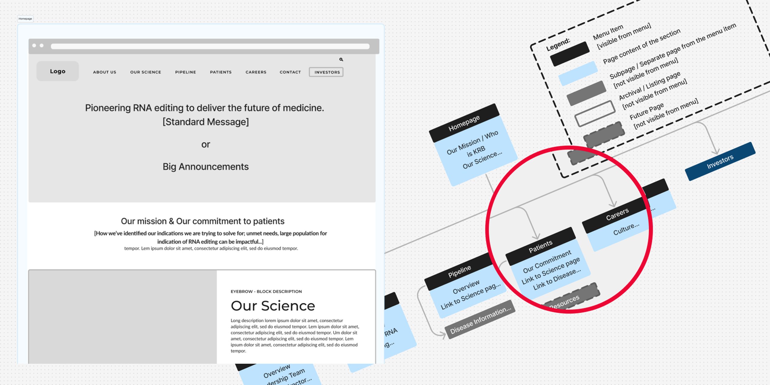
Our methodology was centered on a data-driven and user-focused strategy. We began by conducting a thorough audit of the existing website and user experience, identifying pain points and areas for improvement. This analysis was crucial for generating an optimal user journey that was both logical and compelling.
To ensure Korro Bio stood out in a competitive field, we conducted extensive research by analyzing the user experience and design trends of other leading bio-tech websites. This informed our strategic choices, allowing us to create a design that was both familiar in its usability and unique in its execution.
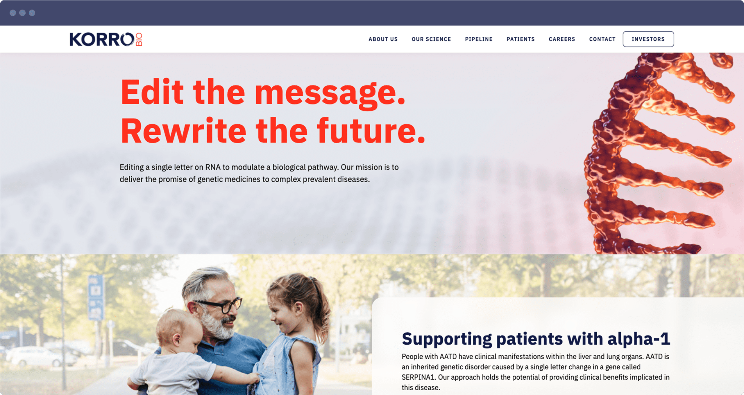
The final look and feel were carefully crafted to be clean and minimalist, mirroring Korro Bio’s commitment to precision and innovation, and ensuring a seamless user experience from the moment a user lands on the page.
“Thank you all so much! Very exciting for Korro!
Maddie McKenzie
Executive Assistant
Key deliverables
- A detailed analysis of the existing site’s structure, content, and user flow, highlighting key areas for improvement.
- A new, optimized user journey and sitemap that provides a clear and intuitive path for all user types.
- A comprehensive review of leading bio-tech websites to inform design decisions and brand positioning.
- A refined visual identity with a focus on a clean, minimalist style, improved typography, and a modern color palette.
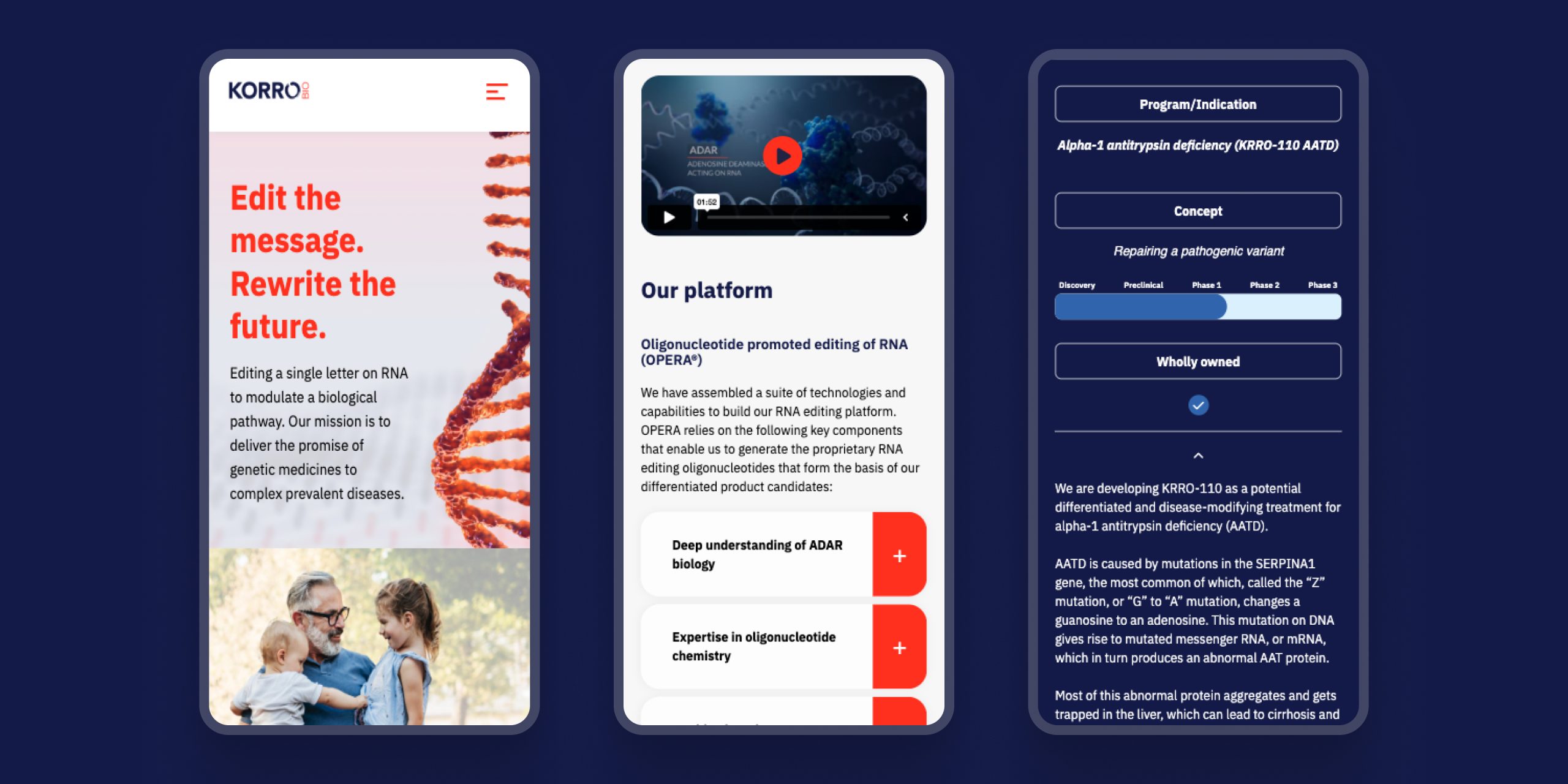
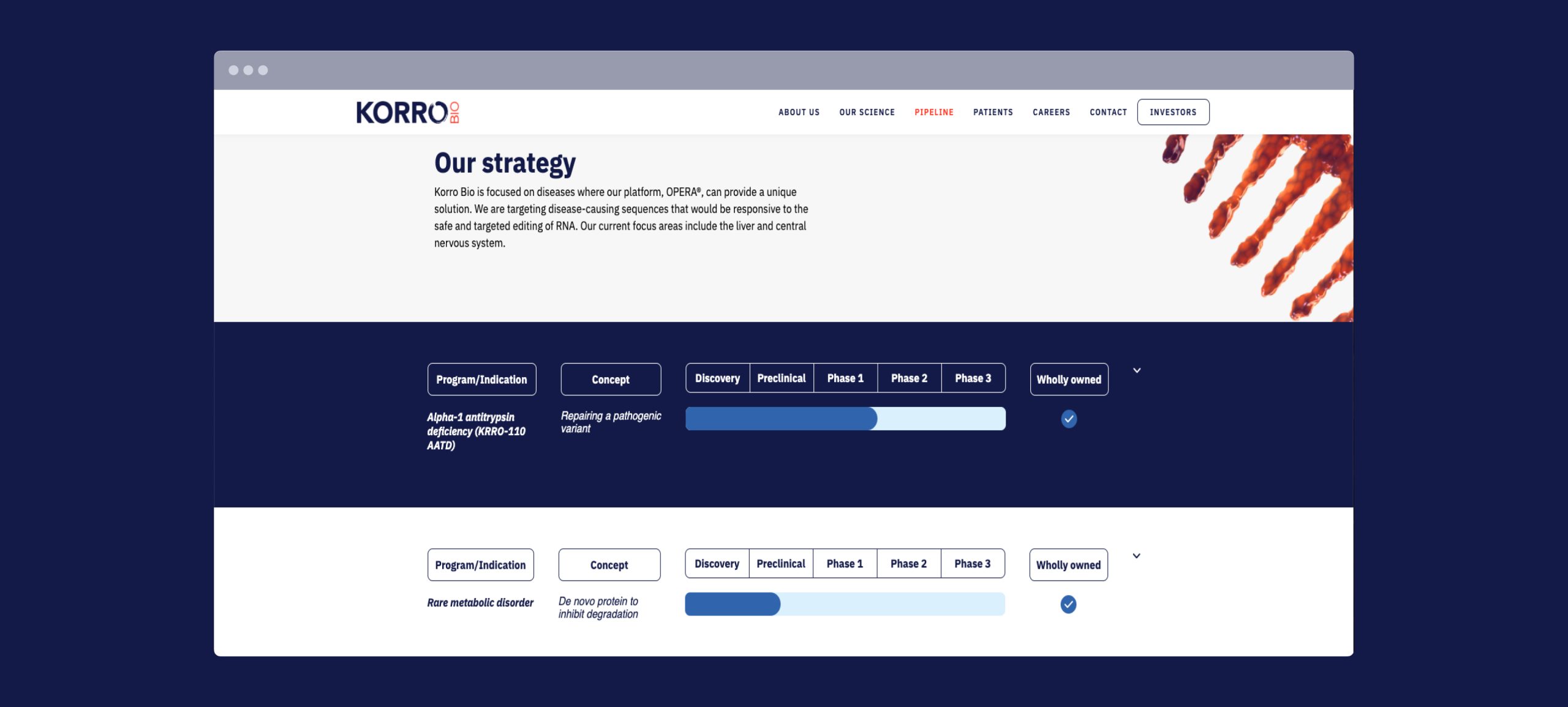
- The final website design with enhanced readability, improved contrast, and overall accessibility best practices.

The results
The strategic redesign of the Korro Bio website yielded significant and measurable results, validating our user-centric approach. The number of users exploring the site’s content and navigating to multiple pages increased, indicating a more engaging and effective user journey.
The average time spent by users on the website saw a notable increase, demonstrating that the new design successfully captured and held their attention.The clean design and improved typography led to a more enjoyable and effortless reading experience, ensuring the brand’s message was communicated effectively without cognitive overload.
Our role
We guided the Korro Bio project from its foundational strategy through to its final implementation. Our team served as the central partner in translating the company’s vision and goals into a clean, functional, and visually compelling user experience.
When the message is important, design needs to get out of the way
We create clear, accessible websites for ambitious organisations. Let’s talk.