OUR WORK Tegria
A redesign focused on clarity and connection
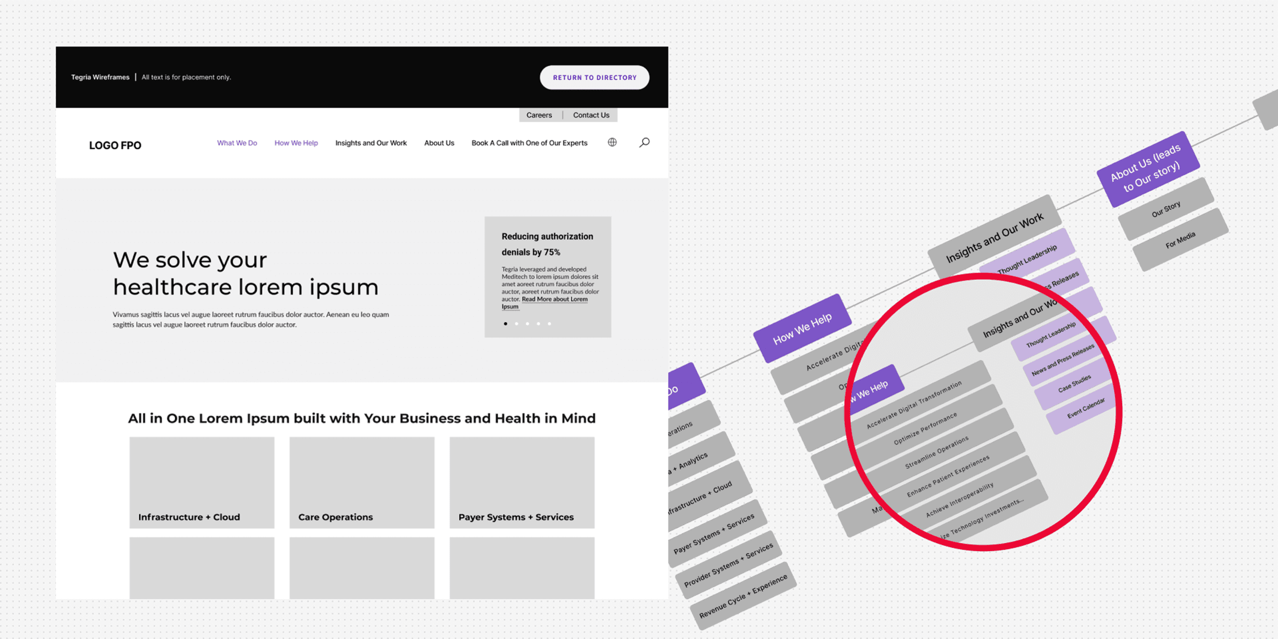
How we redesigned a complex site to reflect scale, improve clarity and drive more enquiries.
Project summary
The Tegria website redesign was a strategic project aimed at enhancing the user experience and overall layout to better communicate the company’s value proposition. Our primary goal was to transform the site into a more intuitive, accessible, and visually compelling platform.
By focusing on a clean, logical structure and a user-centric design, we successfully created a digital experience that guides visitors to the information they need with clarity and purpose.

The challenge
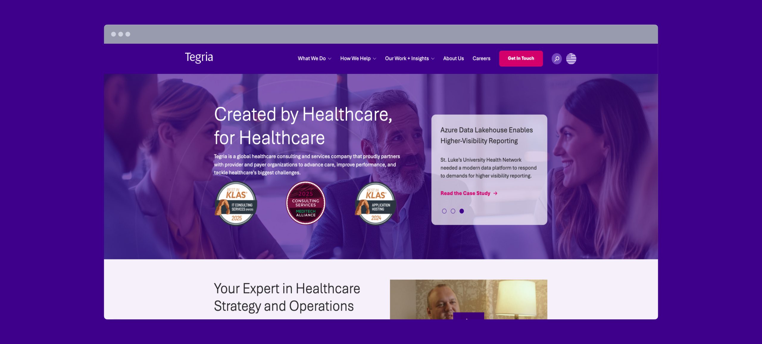
The original Tegria website presented challenges in both user experience and navigation. The existing layout was not optimized for a seamless user journey, potentially leading to confusion and friction for visitors.
The site’s structure made it difficult to quickly grasp Tegria’s comprehensive offerings, hindering effective communication and engagement. The primary challenge was to create a new digital platform that not only looked modern but also served as a clear, functional tool for both new and returning users.
Our approach
Our approach was built on a foundation of user research and strategic design. We began by conducting a thorough audit of the existing website’s structure and content, identifying key pain points and opportunities for improvement.
This analysis was crucial for developing a user journey that was both logical and highly effective. We analyzed the design trends of leading tech and consulting firms to ensure Tegria’s new site would stand out in a competitive market while maintaining a professional and authoritative feel.
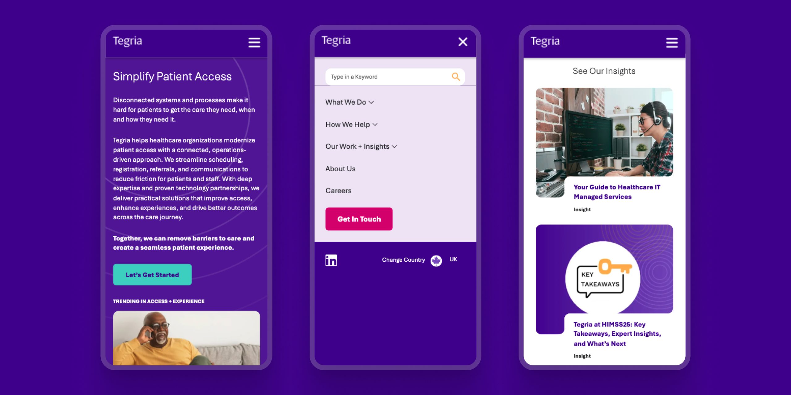
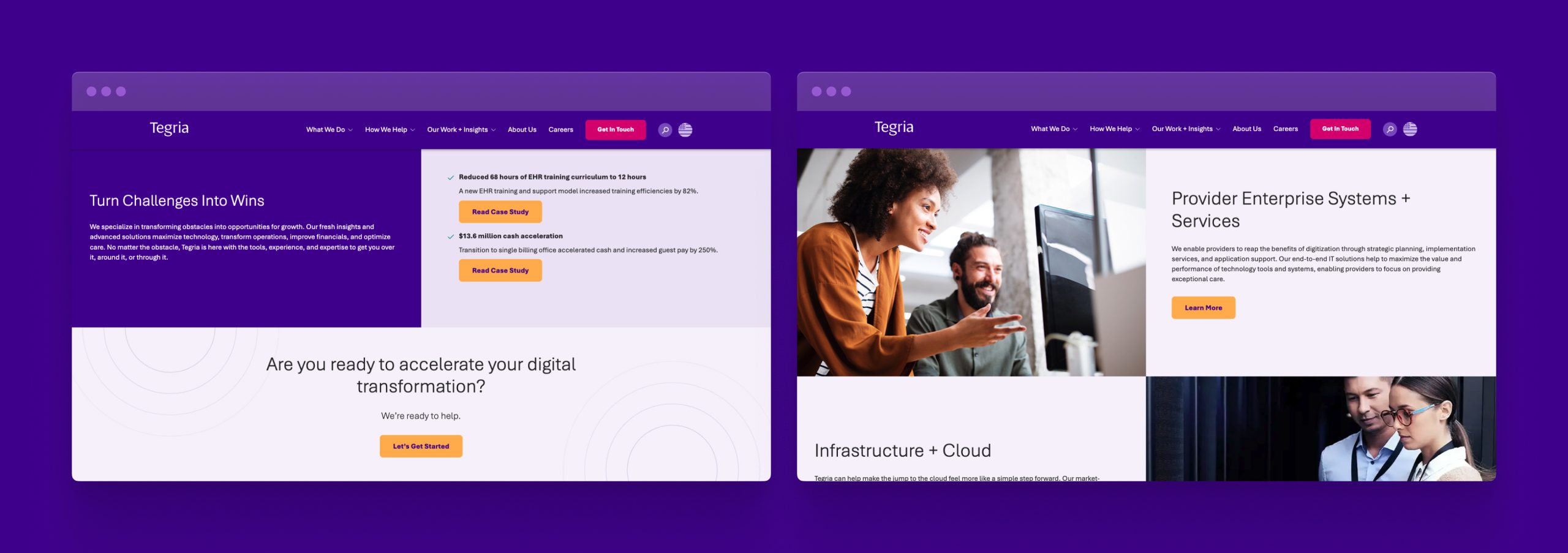
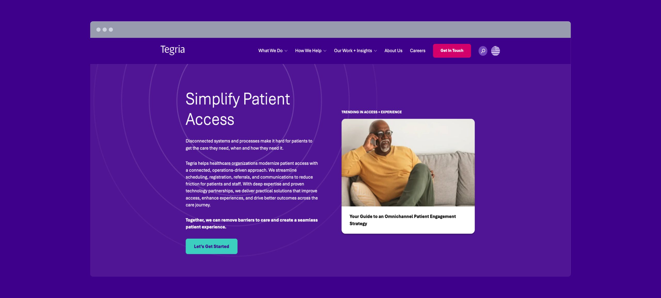
The new design emphasizes a clean, minimalist aesthetic, with a clear layout and visual hierarchy that directs users’ attention to key information, mirroring Tegria’s commitment to delivering straightforward and effective solutions.
“The new site captures who we are perfectly. It’s clean, confident, and easy to manage—our whole leadership team is impressed.”
Matt Harper
Director
Key deliverables
- A comprehensive analysis of the existing website to identify usability issues and areas for improvement.
- The creation of an optimized user journey and a streamlined information architecture to enhance site navigation.
- A modernized visual identity with a focus on a clean, professional style, improved typography, and a new color palette.
- The final website design with enhanced readability, improved contrast, and overall accessibility best practices.
The results
The redesigned Tegria website yielded significant improvements, as demonstrated by enhanced user engagement and navigation metrics. The new layout and streamlined user journey resulted in a more intuitive and efficient experience for visitors. Users were able to navigate the site with greater ease, leading to increased time on site and more successful interactions.
The refreshed look and feel now accurately reflect Tegria’s position as a forward-thinking and client-focused leader in the industry.
38k
new users
50%
Increase in pageviews
3.7K
Conversion increase
Our role
Our team was responsible for the end-to-end redesign of the Tegria website. We led the process from initial UX strategy and design to final development and implementation. Our role was to translate the company’s complex offerings into a simple, accessible, and user-friendly digital experience, ensuring a seamless handover and a flawless final product.
Serious business deserves serious intelligence
If your online strategy isn’t pulling its weight, let’s change that. Drop us a message and let’s get started.